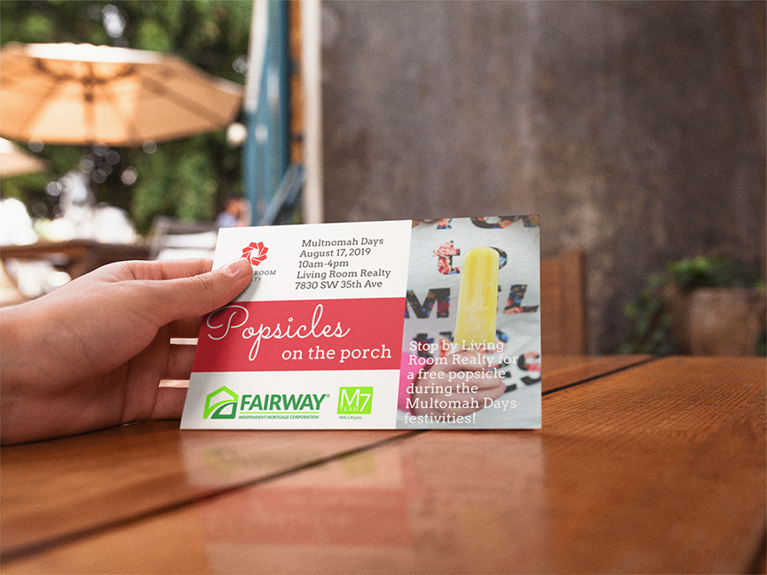
Michael Leland and Melissa Maag approached Rebel Blue with a unique challenge – to design a brand that would sit adjacent to an existing corporate brand and would stand out enough to represent the team’s unique offerings. The two leaders play very different parts, and both wanted representation.
We collaborated on several rounds of naming the team and soon realized we needed to get out of the box.
7 principles 2 Ms
One of the partners pulled out a list of the 7 things he thinks his clients need to be aware of in making the big decision to borrow money for property. Another idea we were floating was the use of the letter “M”, as each of the executive’s names begin with that letter.
That’s when it hit us! M7.
“Sarah led us through the creative process resulting in a short, concise, and extraordinarily accurate version of a brand that is understated yet an excellent conversation piece that encompasses a list of tried and true examples of the benefits we supply to our clients.”


